- Browse and Search
- Dimensional Reduction
- Gene Expression
- Cell-Cell Similarities
- Gene Functional Analysis
ColorCells provides single cell transcriptomic analysis in 5 species including Human, Mouse, Zebrafish, Fruit fly and Yeast. You have ultiple choices on visualization of our datasets.
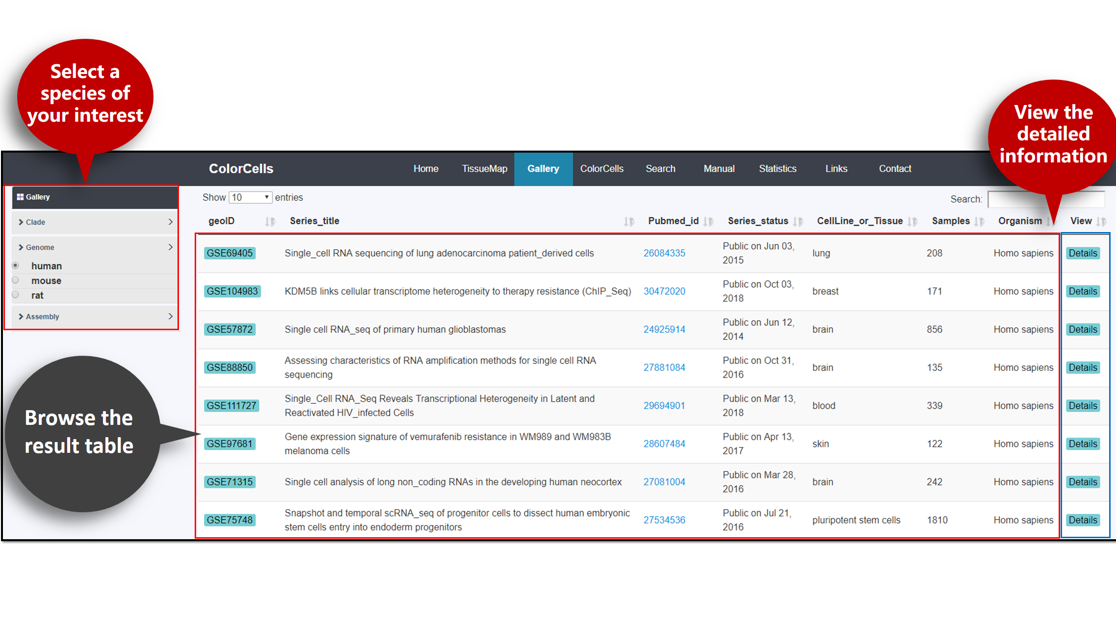
To browse the result tables, click Gallery in the top bar.
You can select data by Clade, Genome and Assembly. The result table will display the information of studies of the particular species, including its geoID, Series title, Pubmed id, Series statues, Source cell line and Tissues and more.
To view detailed information of these studies, click Details on the right.
To precisely access your prefer information, please click Search in the top bar.
You can search by Cell line or Tissue, Gene Name, Gene ID, GEO ID and Pubmed ID. (Please specific the Type before searching.) The results will be displayed in the same page. Click the geoID on the right for details.

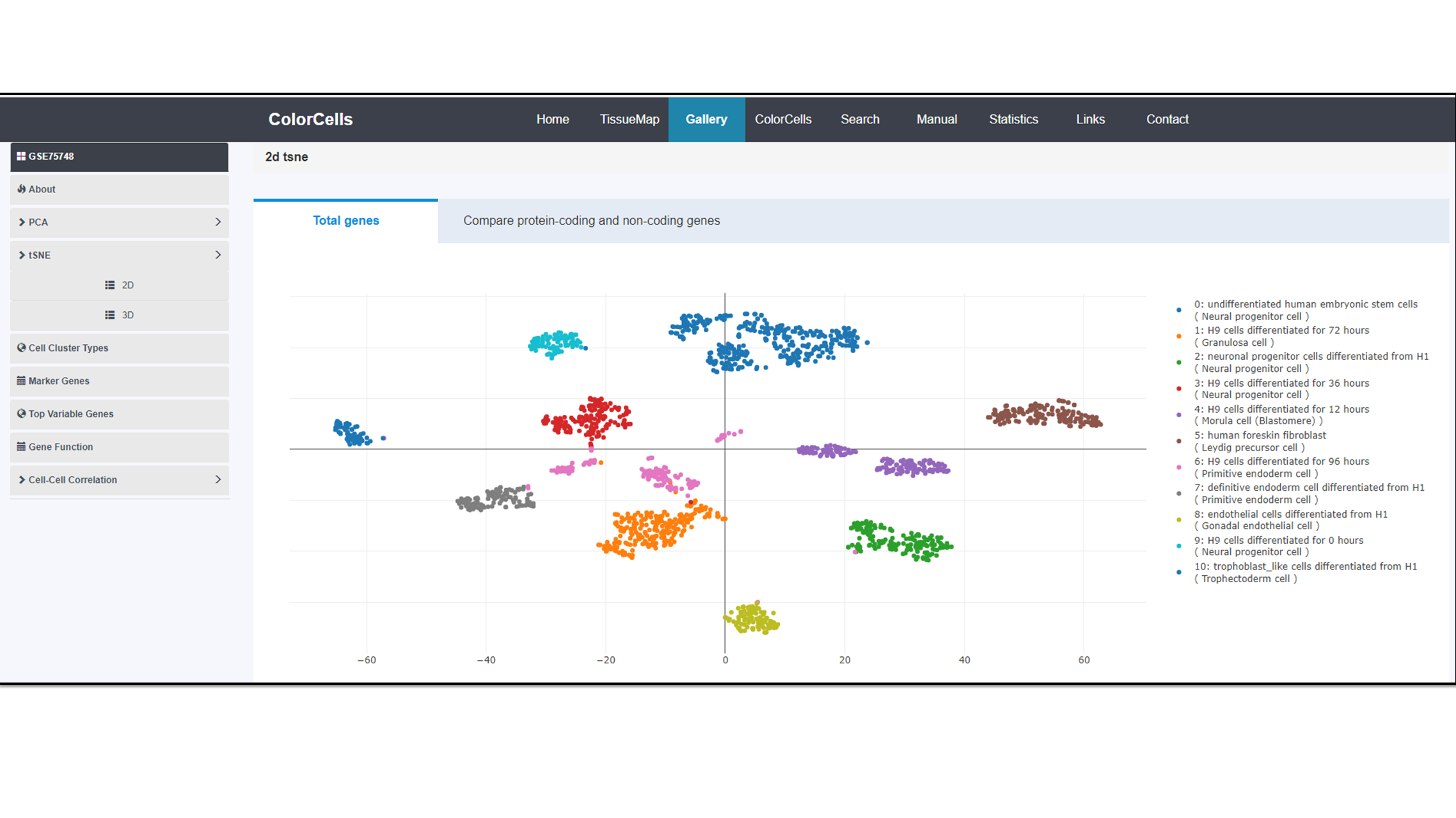
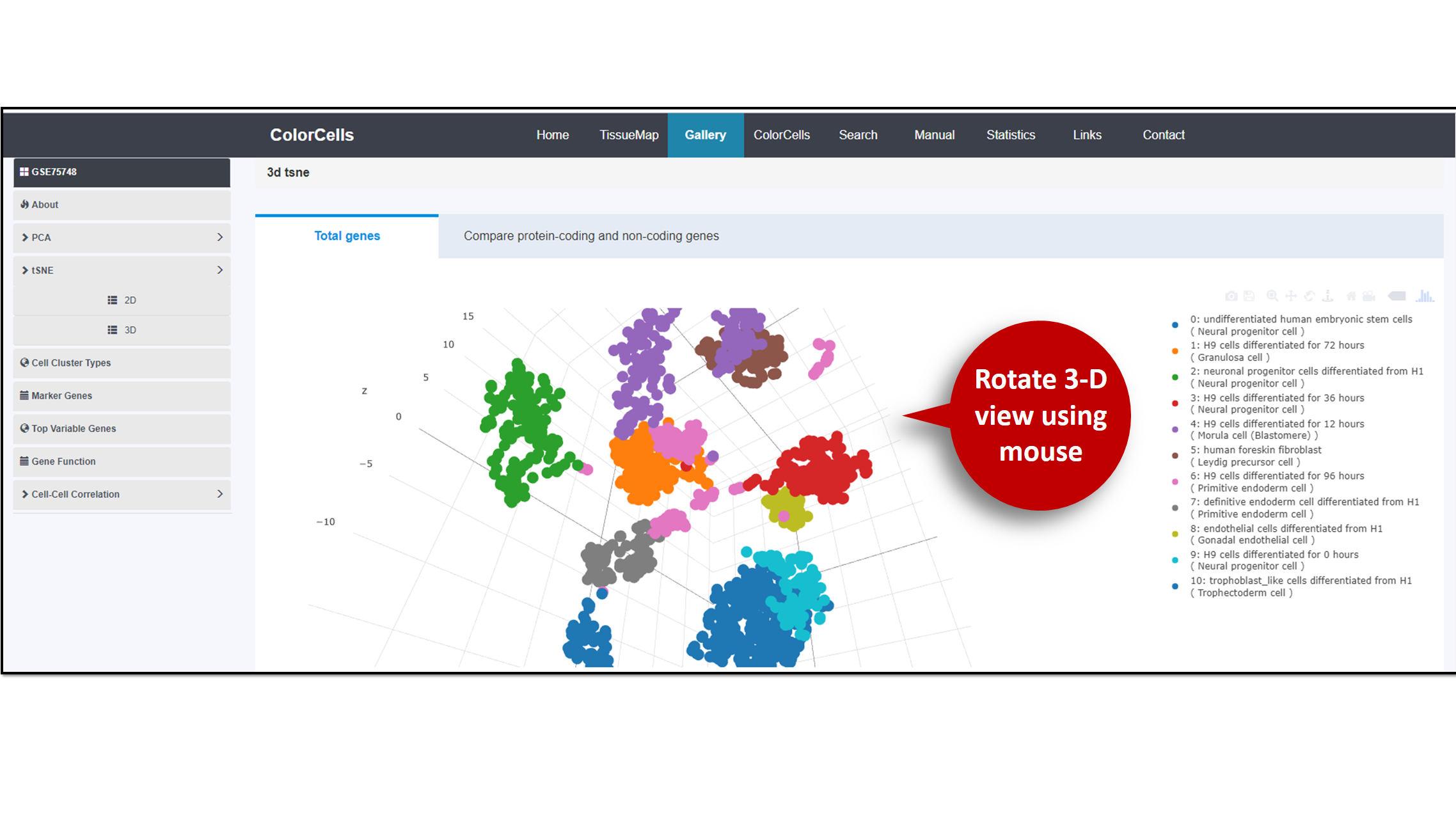
We provide two dimensional reduction methods to display the cell clusters: Principal components analysis (PCA) (1) and T-distributed Stochastic Neighbor Embedding (t-SNE) algorithm (2). You can view them in both 2D and 3D.
2D
3D
You are allow to rotate the image with your mouse. To Download the image, please click the "Download" bottom at the top float bar of the image
References:
[1] Pearson, K. (1901). "On Lines and Planes of Closest Fit to Systems of Points in Space" (PDF). Philosophical Magazine. 2 (11): 559–572. doi:10.1080/14786440109462720.
[2] van der Maaten, L.J.P.; Hinton, G.E. (Nov 2008). "Visualizing High-Dimensional Data Using t-SNE" (PDF). Journal of Machine Learning Research. 9: 2579–2605.
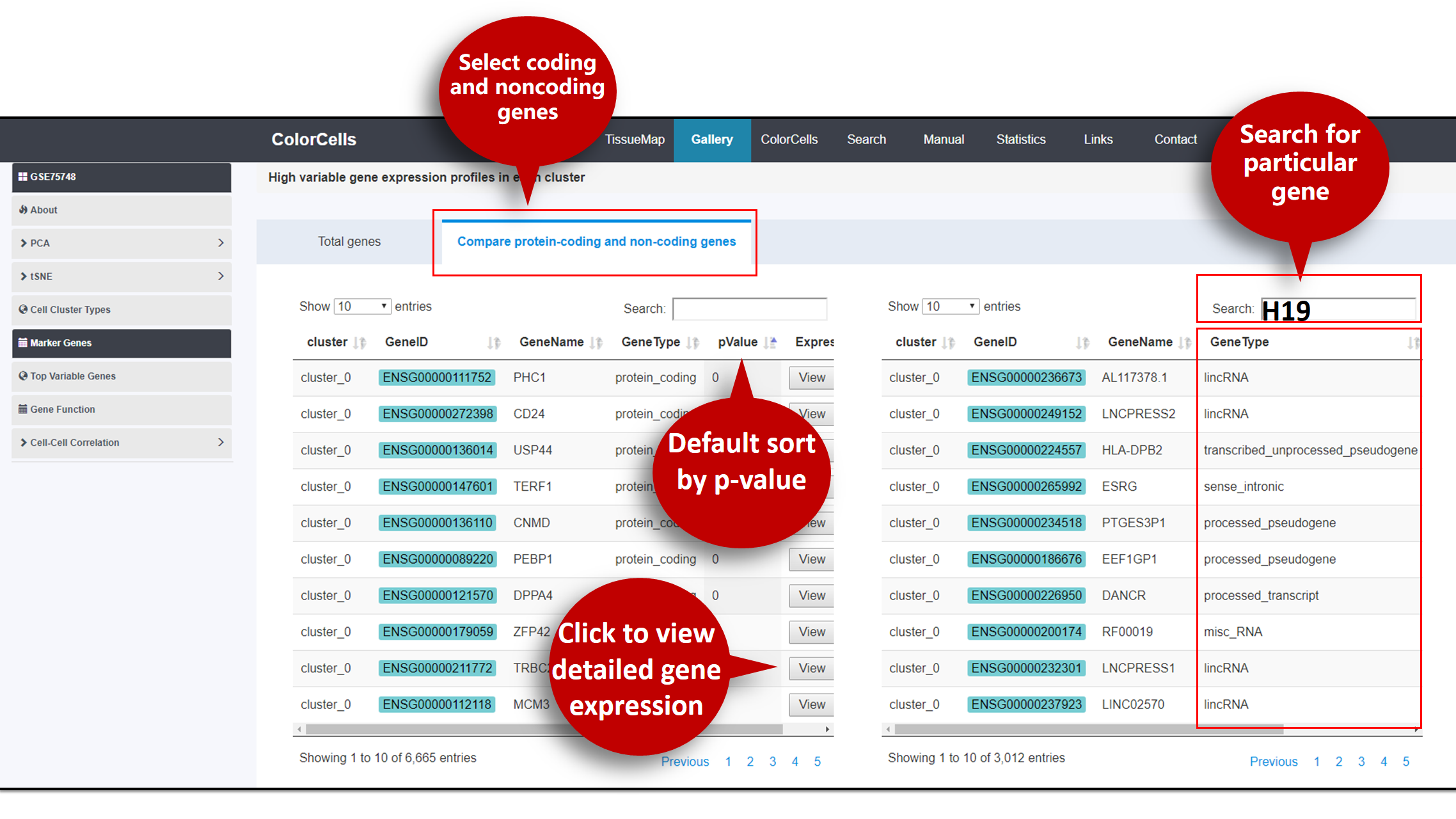
The tables of . You can view tables of high variable Protein-Coding or Non-coding genes expression in each cluster.
Try to use "Search" if your are interested in particular genes.
You can sort genes by p-value (Default: Ascending).
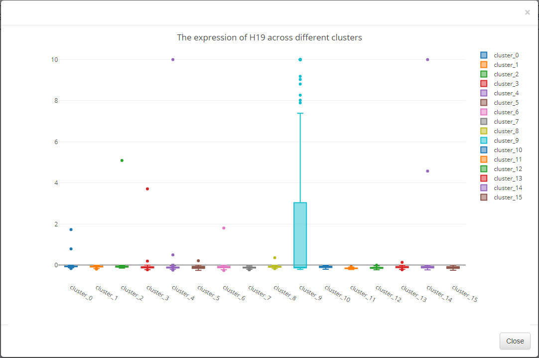
Click View for the selected gene expression profile among clusters.
The expression profile among clusters of selected gene are displayed in box plot.
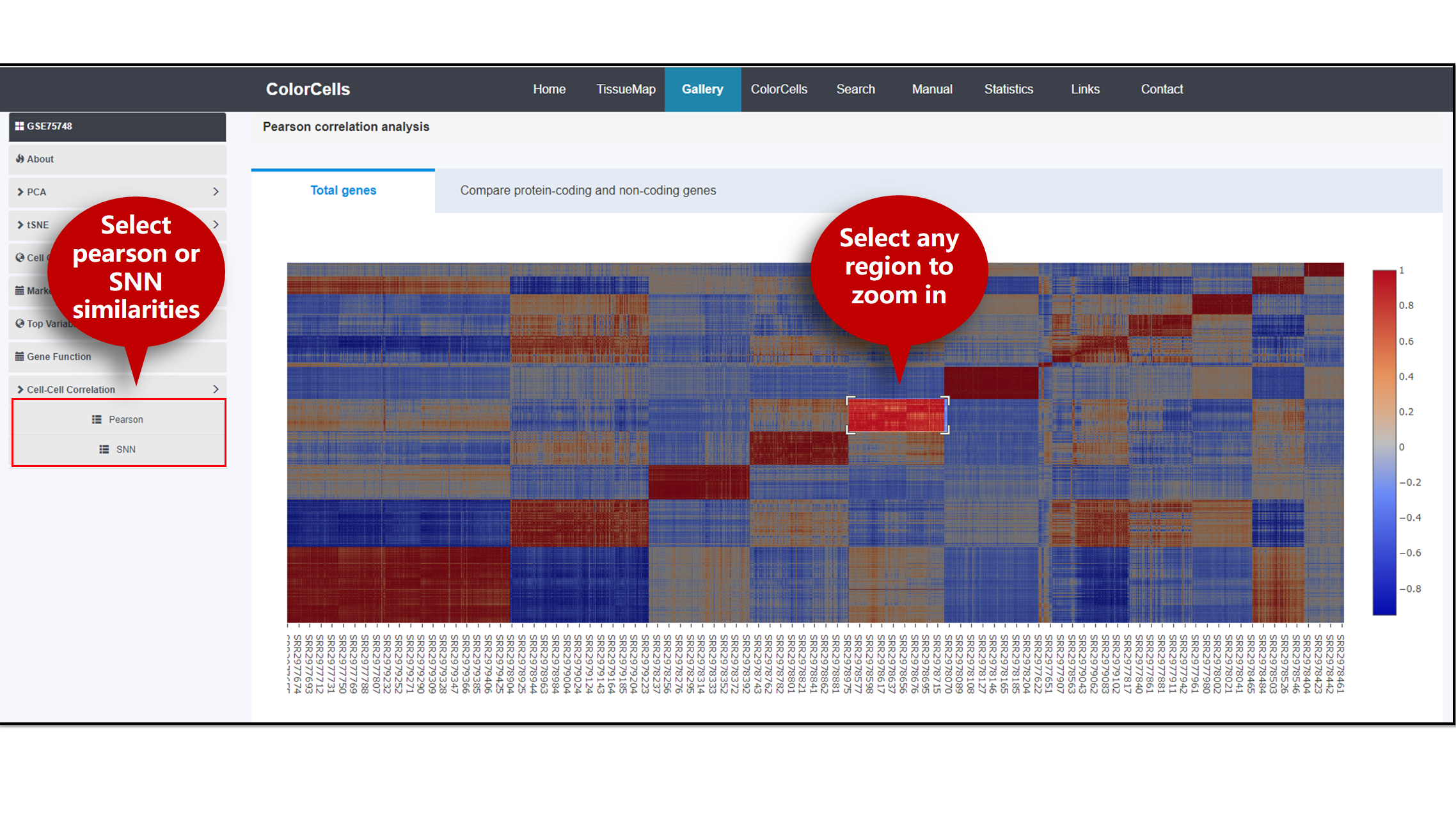
The correlation of cells in the study can be presented by two methods, Pearson or shared nearest neighbor (SNN) [1-2]. If you are interested in certain region on the heatmap, click to zoom in.
References:
[1] L. Ertoz, M. Steinbach, V. Kumar, "Finding clusters of different sizes shapes and densities in noisy high dimensional data", Proceedings of Second SDM, 2003.
[2]L. Ertoz, M. Steinbach, V. Kumar, "A New Shared Nearest Neighbor Clustering Algorithm and its Applications", Workshop on Clustering High Dimensional Data and its Applications at 2nd SDM, 2002.
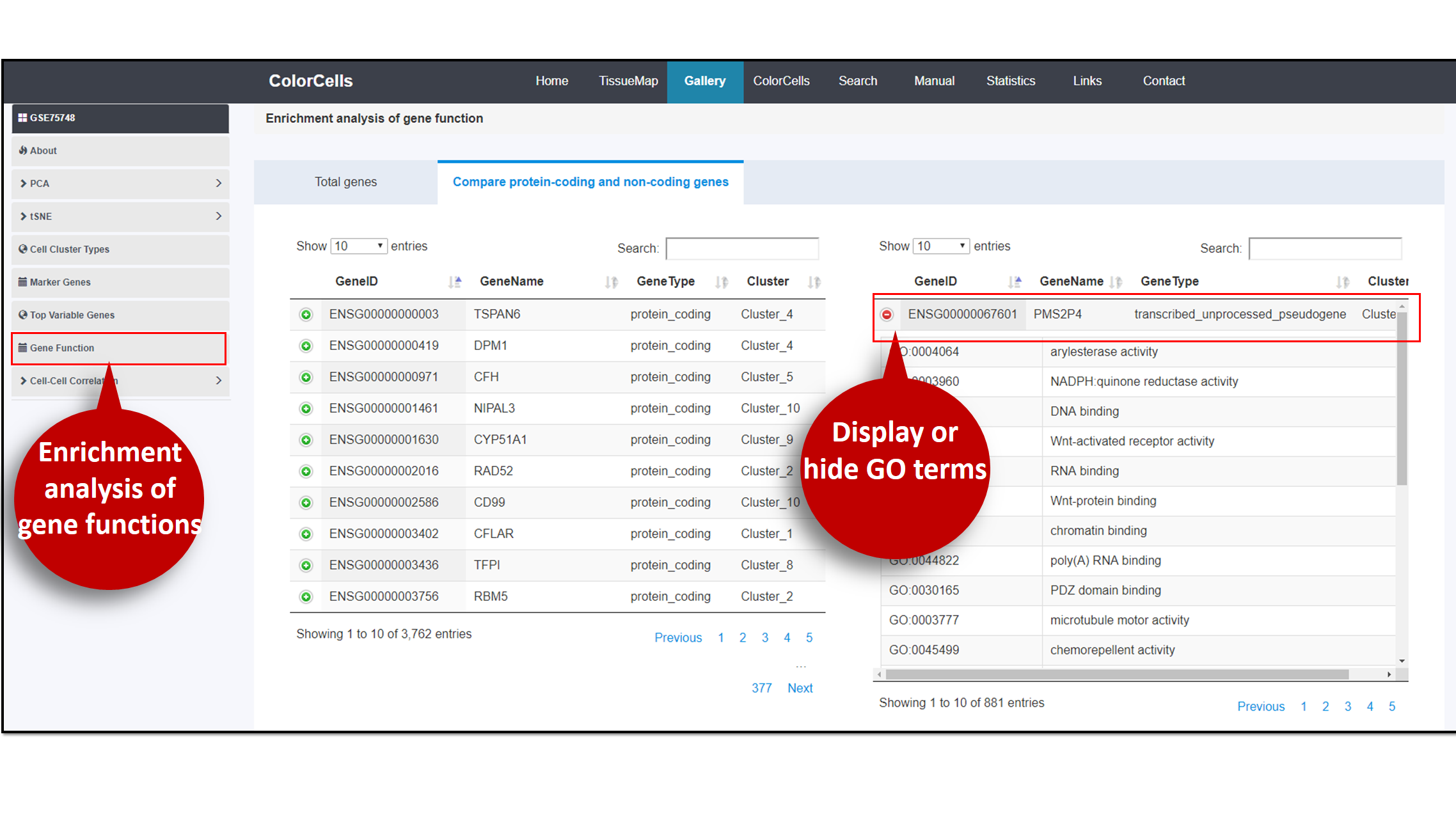
Genes in the study can undergo enrichment analysis. In the table of the analysis result, you can choose to display or hide hit gene names in GO term.
References:
[1] Benjamini, Y. and Hochberg, Y. (1995) Controlling the False Discovery Rate: A Practical and Powerful Approach to Multiple Testing. Journal of the Royal Statistical Society. Series B (Methodological), 57, 289-300.